An iconique brand elevation
A medical aesthetics master injector is ready to take the leap to turn her private practice into a luxury founder led medical aesthetics spa.
The rebranding case study shown below was a team effort of the Pinpoint Creative agency team with Aria taking the lead as Senior Designer of this brand refresh development and overseeing the Art Direction of all branded assets to follow to ensure brand consistency among both print and digital assets. Her design team included designers Abigail Melton, Leah Hunt, and Julia Livshin. With copywriting and photographic and texture styling by Jessica Marin, and overall Creative Direction oversight by Tamara Vileta.
A Refreshed look
This project is what we could call a “Brand in a Box” brand development guide. Including simplified yet clear guidelines on brand usage for an existing brand, simultaneously making small impactful adjustments to elevate the brand without straying to far from it’s core purpose and mission. Aria took part in creating the presentation and presentation layout, as this was among the first Brand in a Box projects done, Aria took this presentation from beginning to end through revisions and finalization, and Art Directed the design team on the printed assets that were to come.
-
With Iconique already existing as a brand, Aria came into this brand refresh project with a clear understanding provided by the client to the team that she was focused on elevating the look and feel of the brand while staying true to her original message.
-
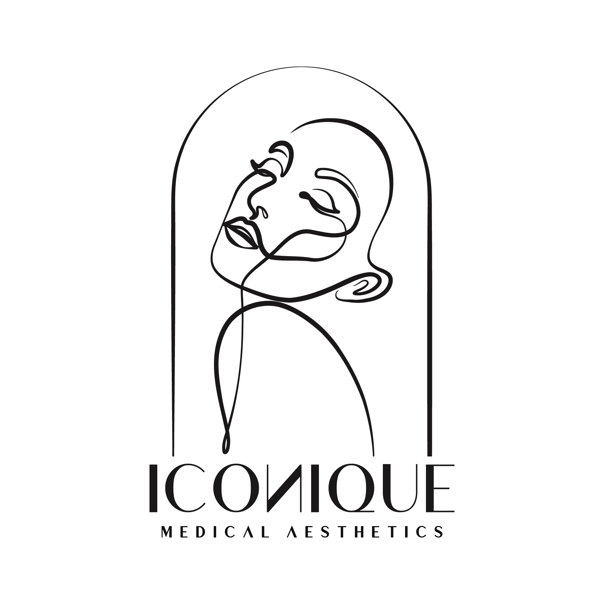
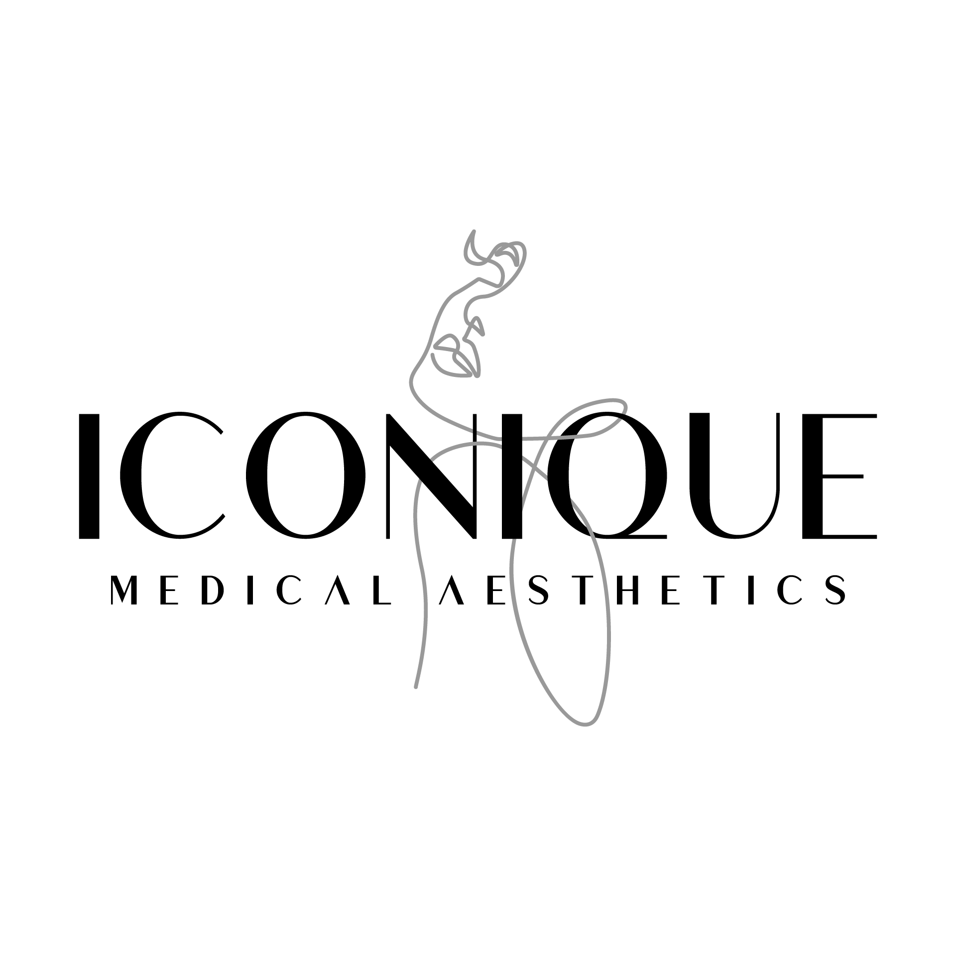
The logo development team consisted of Senior Designer and Art Director, Aria Bird, Graphic Designer, Abigail Melton, and Creative Director Tamara Vileta. Throughout the logo development process the client chose Aria’s design to help bring to final form.
-
With multiple color palettes proposed by the design team, Aria worked closely with the owner and founder of Iconique to decipher approved color pairings with clear stated direction on usage.
-
A new way of presenting typography proposals was submitted by designer Abigail Melton, who worked largely with font and typography within the creative team and collaborated with Aria’s overall art direction.
-
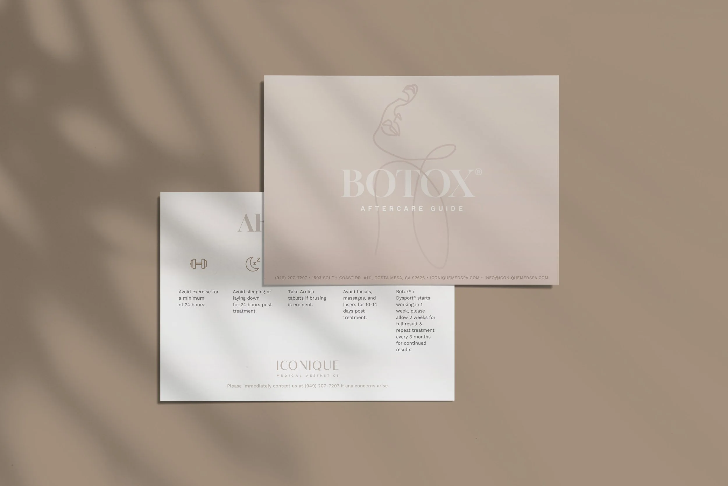
Photographic and texture styling curated by designer, Jessica Marin and overseen by creative director, Tamara Vileta. Aria worked with the development of the “Do’s & Don’ts” in tandem with Jessica Marin organizing and applying revisions and the layout and structure of how the photography, textures, and Do’s & Don’ts were revised, clarified and presented.
-
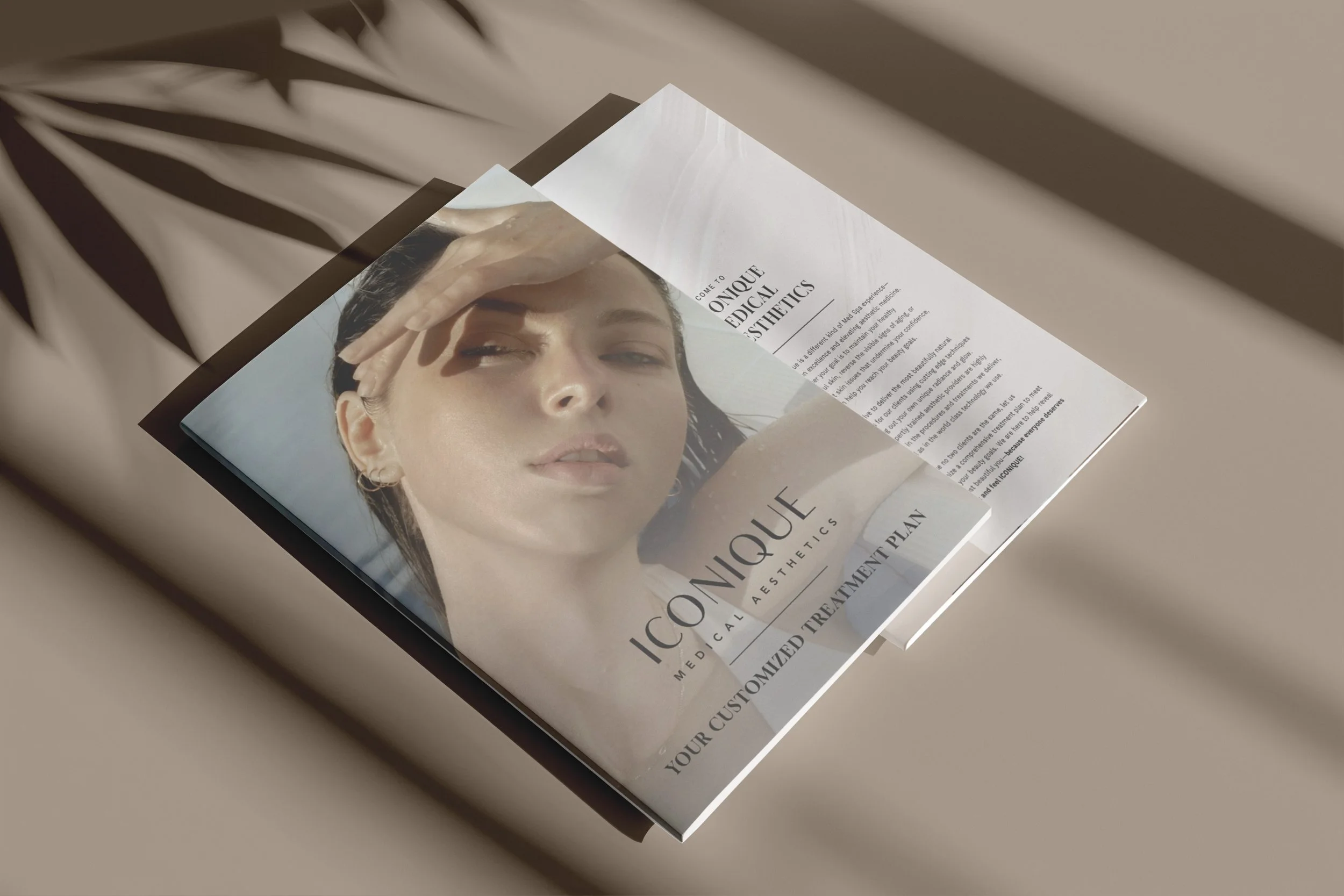
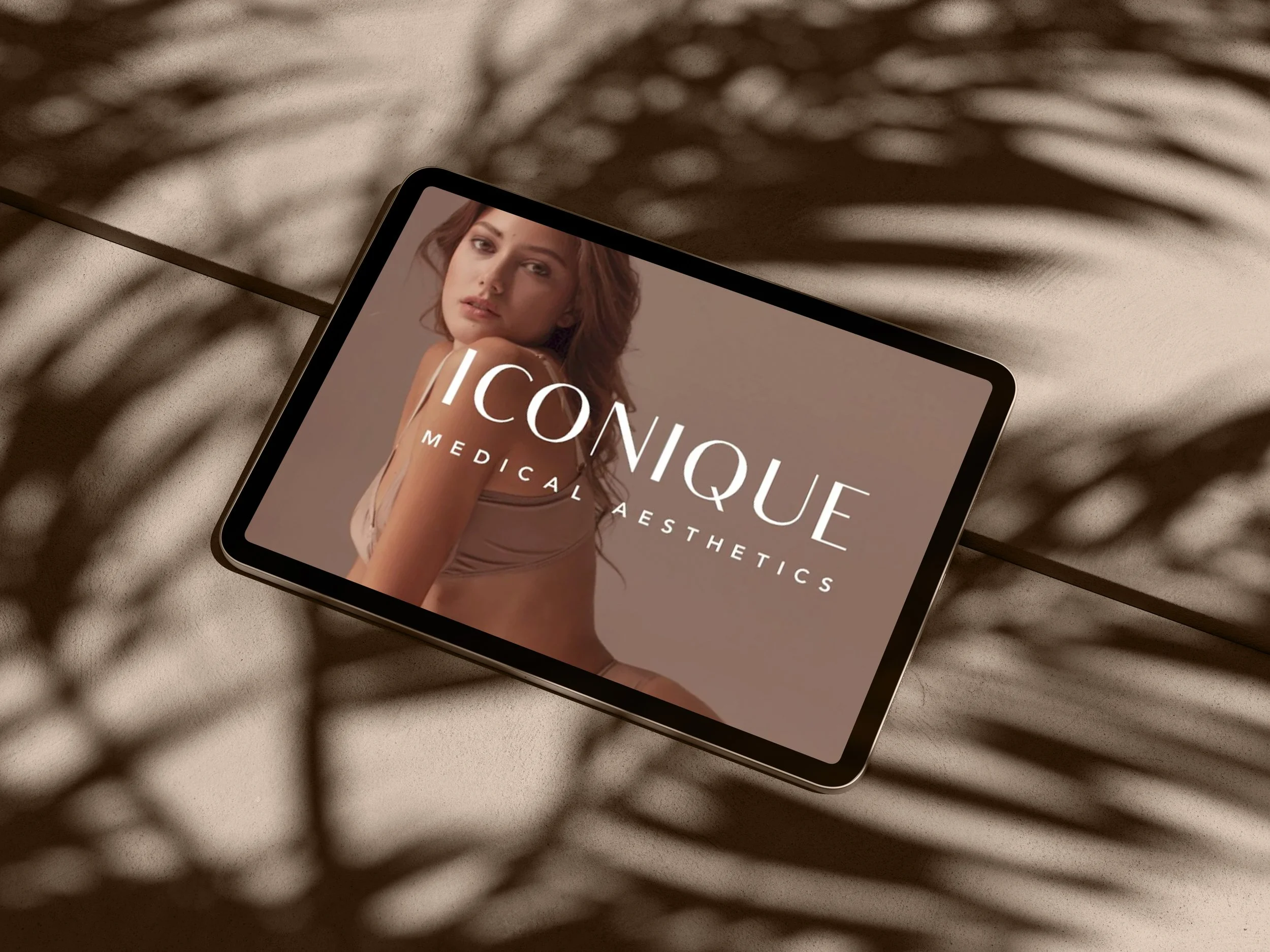
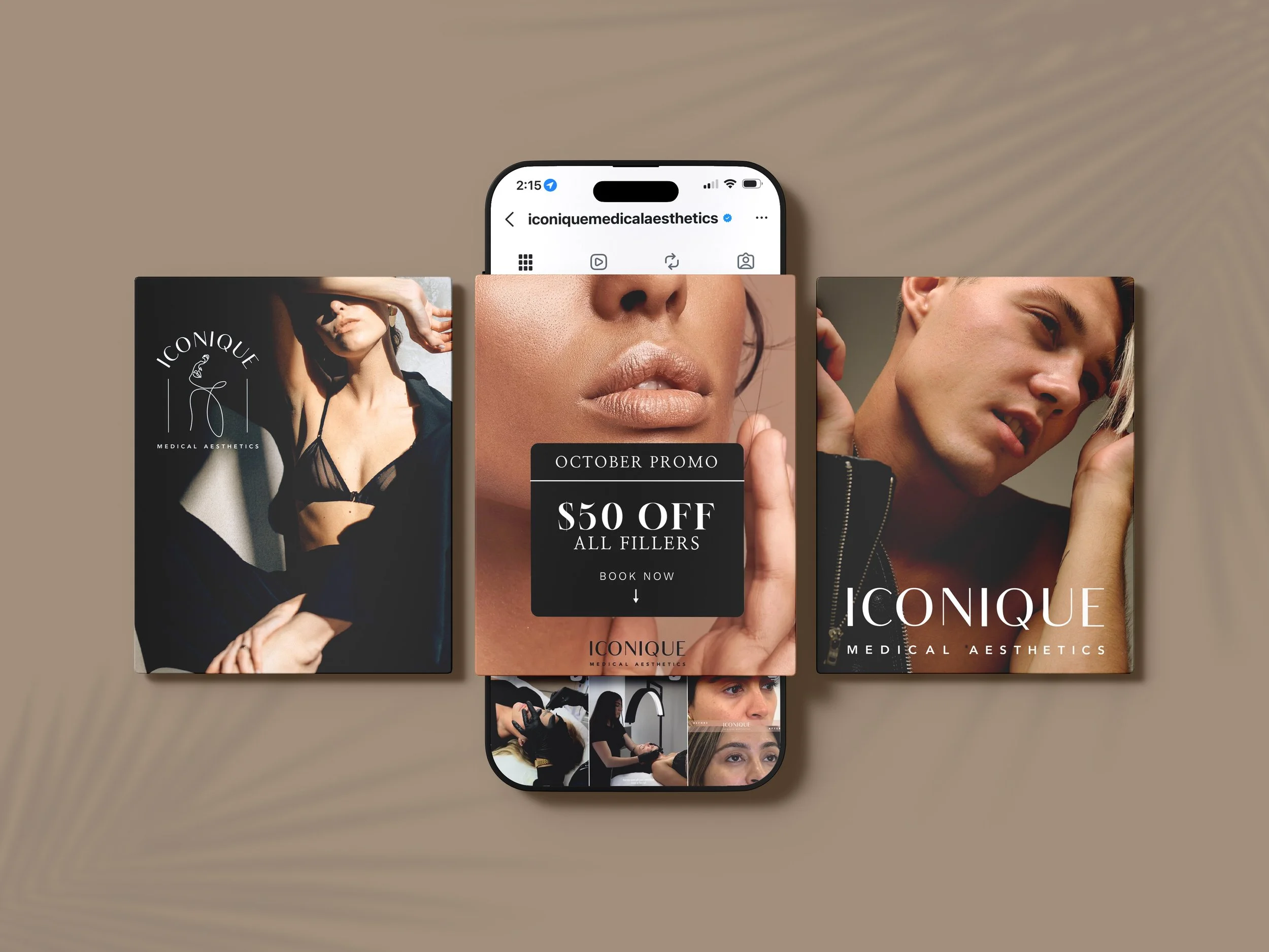
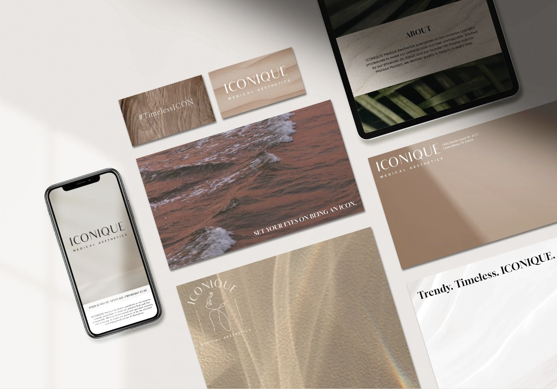
Towards the end of this case study you will find the branded assets. Every member of the design team contributed to the branded assets. Aria worked closely with the owner and founder of Iconique to determine the creative direction of the assets’ look and feel. Aria worked through revisions with her team and redirecting the art direction of assets where needed. Aria was also a contributor to designing some of the branded assets herself including the brochures, treatment cards, and more.
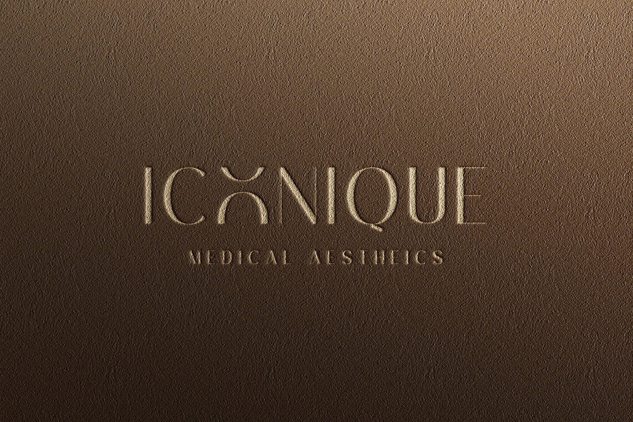
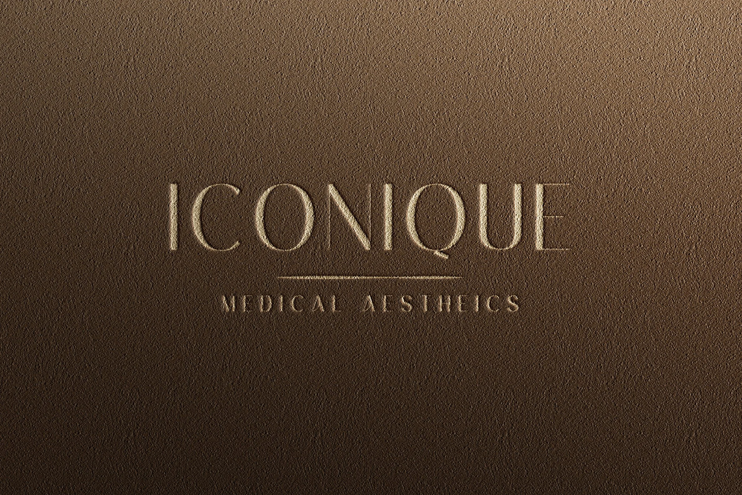
LOGO DEVELOPMENT
The below logo proposals designed by Aria Bird are a few of the outtakes from the client’s final logo design and icon choices.


Color palette and hierarchy
With all designers contributing to color palette proposals, once the winning palette was chosen by the client, Aria aided in refining and delivering a color palette hierarchy outlining the usage and direction for color within the brand. Branded sweats shown here not designed by Aria, but to show the application of the brand development the Iconique team was able to confidently carry out throughout all applications.
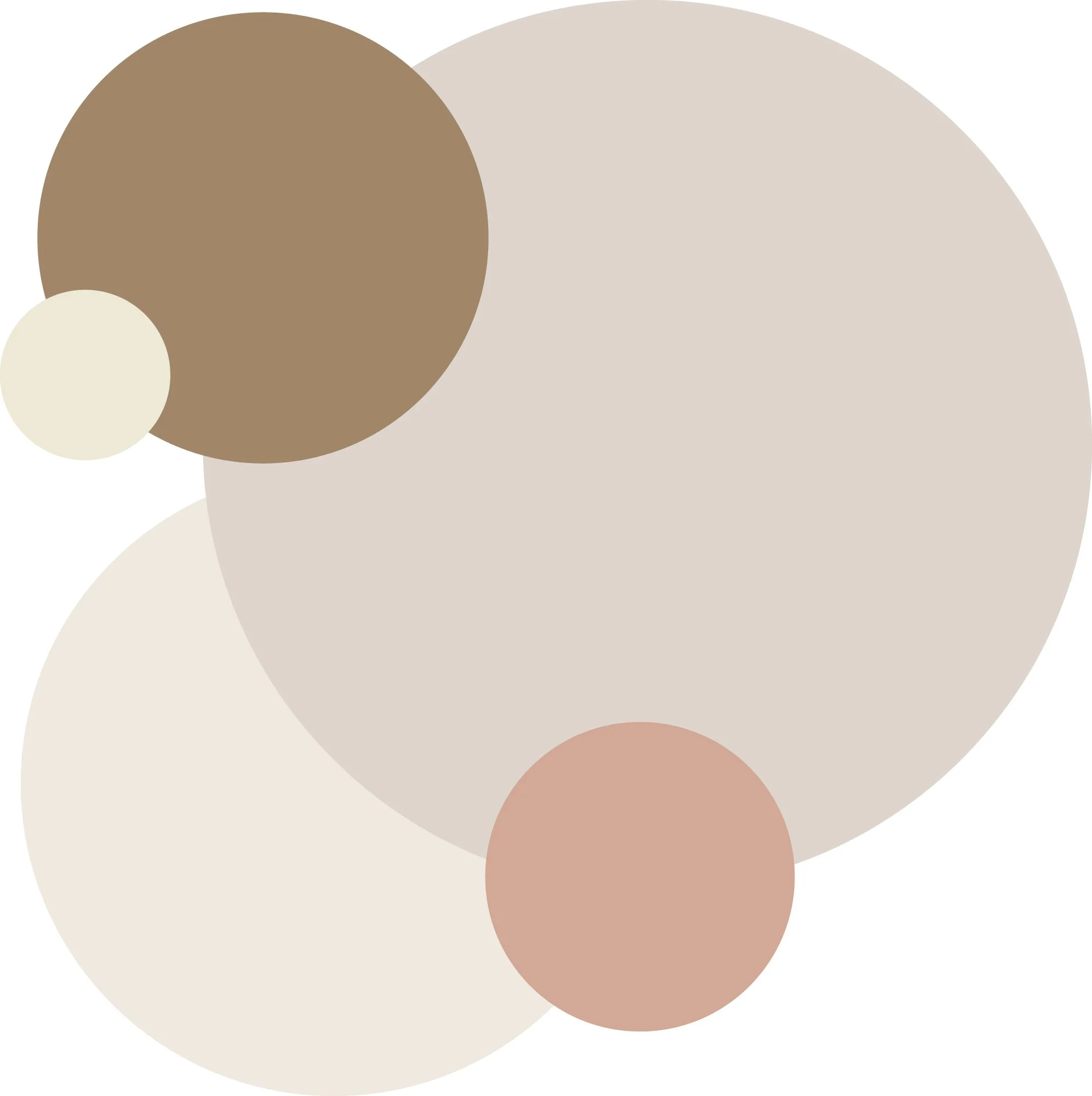
For backgrounds and graphic elements, we wanted to use pairings of contrasting and monochromatic colors, for example the Cinnamon on Pearl or Sugar on Blush. Mixing light tones on with warm tones, or high contrast warm on light tones for a desired relaxed, neutral, and natural look.
When setting typography, we strived for legibility with contrast, keeping it simply by utilizing white on dark backgrounds and black on light backgrounds. Logo would remain white or black in all contexts.
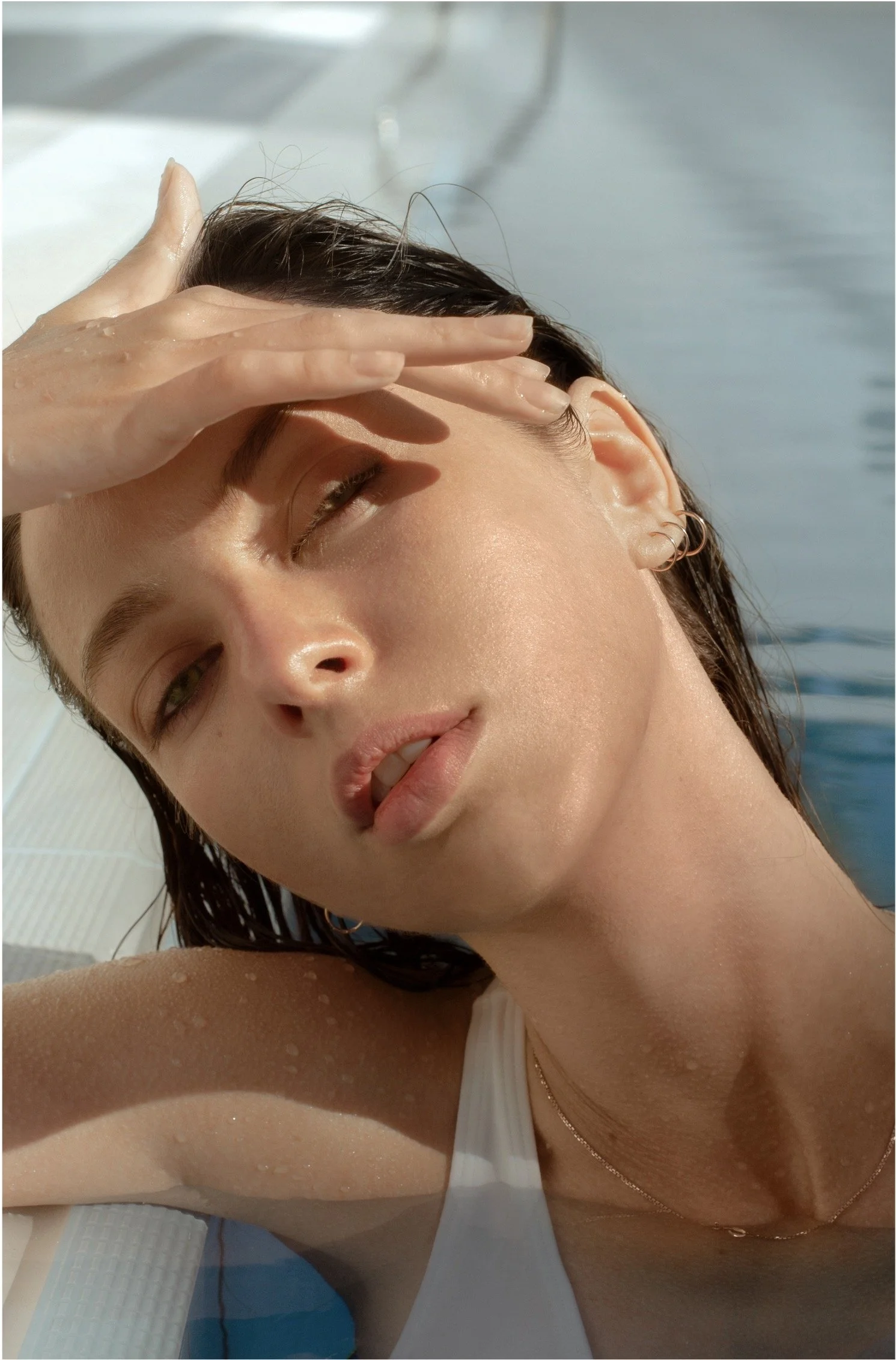
Photography & textures
With the photo and texture libraries curated by photo and texture style curator Jessica Marin on the team, Aria was able to oversee and work with the client to refine the “do’s and don’t’s” for both curations and ensure their usage was complied with throughout all branded assets and print materials that the design team at Pinpoint Creative produced for this brand.
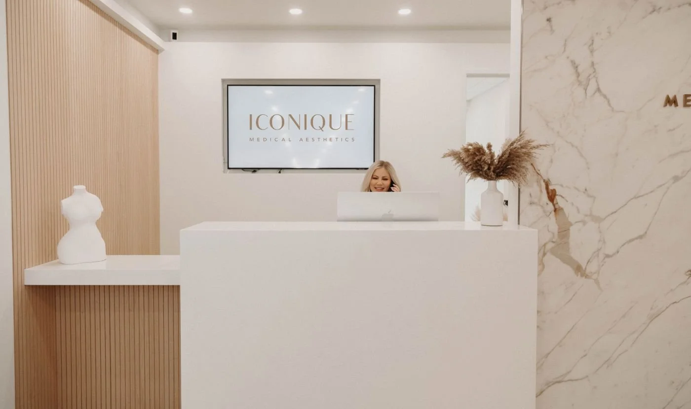
BRAND APPLICATION
Though this project is from a few years ago, it has been deemed worth showcasing as this project proved to be one of the first learning curves of how to be an Art Director for Aria. Aria reviewed all branded asset materials and approved them and by the time they were all produced, they didn’t all quite feel cohesive enough. This is when Aria helped personally dive back into each branded asset item and worked directly with the client to help designers bring all assets into a clearer alignment. This was a large undertaking and a wonderful learning lesson with print production and color proofing. All in the end turning out as a beautiful cohesive set by designers Abigail Melton, Julia Livshin, and Leah Hunt and the collaborative refinements of Aria shown below.